Docs
mgallery demo
Posted on July 4, 2023 (Last modified on August 21, 2023) • 2 min read • 229 wordsA demonstration of some usages of the mgallery shortcode
A gallery can be configured in many ways. First there is the option to show it as a grid or a masonry. The default thumbnail ratio is different for a grid and a masonry. For a grid it is 1x1 and for a masonry the original image ratio is used, because a masonry will only look like a masonry when the images are not equally sized. A few of the possible options are shown below.
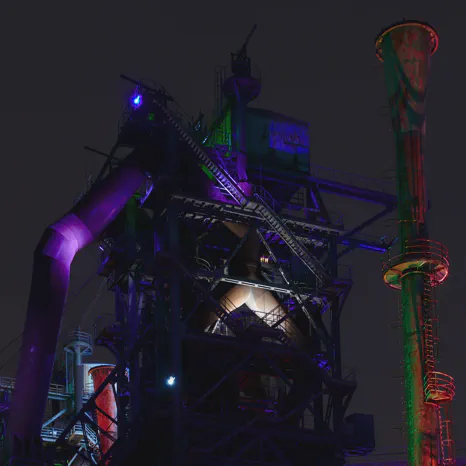
The following shows a grid in 3 columns.
{{< mgallery "list"="img/*" "cols"=3 >}}The default type when it is not specified is “grid”.
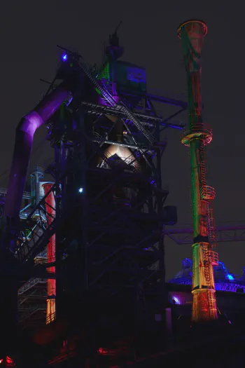
And to show the same image set as a masonry, the type is set to “masonry”. In this case 4 columns are used (which is the default).
{{< mgallery "list"="img/*" "type"="masonry" >}}As can be seen, the images also become smaller. This is because the images are sized to fit the available space. With more columns, there is less space available per image.
To show the masonry, with no space between the images and also no corners (because that looks better), the following is used:
{{< mgallery "list"="img/*" "type"="masonry" "gap"="0" "radius"="false" >}}A class can be added to the images in the gallery. In this case a border to the images is added in the ‘danger’ color, which is red.
{{< mgallery "list"="img/*" "cols"=3 "class"="border border-danger" >}}